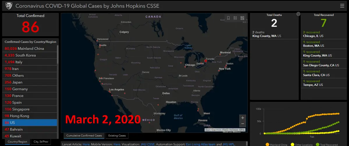
One thing’s for sure, media outlets are reporting all different numbers and we are not getting the information. For instance, the death rate is well above 3% but everyone keeps saying it’s under 2%. The good news? Johns Hopkins has been updating their interactive map and they allow everyone to access their information at no charge.
These maps show where the coronavirus is now and you can and allow anyone to access their information. You can also drill down to your country, state, or city.
Laptop or Desktop Users Click this Coronavirus map link
https://www.arcgis.com/apps/opsdashboard/index.html#/bda7594740fd40299423467b48e9ecf6
Mobile Phone Users Click this Coronavirus map link
https://www.arcgis.com/apps/opsdashboard/index.html#/85320e2ea5424dfaaa75ae62e5c06e61
You can also learn about:
Free Printable, Sharable Disinfectant List
What to look for in a Hand Sanitizer

